....

Don't miss another freebie, sale, or special announcement!
Use the newsletter sign-up forms right over there --->
Pick the one that fits your interests: Regular newsletter or CU only.
Showing posts with label Photoshop Elements. Show all posts

Wednesday, May 18, 2011

How'd They Do That? Gradients

Hi Everyone! It's Jenn (jk703) here to share a fun idea to use on photos, and even background papers.


Gradients That Fade
Start a New Document, by Right Clicking and Duplicating your photo in a New or Untitled file. Save. You will have the original if you need it by doing this step.

Within the Layers Palette, click on the "Mask" icon at the bottom of the palette.
This will add a layer mask, which you can see next to your photo. This fade is essentially a white/black fade, a transparent mask for your photo. The white in the mask will allow the picture to show through, while black will hide parts of the the picture. The middle grey areas will affect how transparent your picture will be.

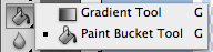
Go to the Toolbars, and use the Gradient Tool.

In the top toolbar, you will also see the options that you can change for your mask. How it looks, the colors and the transparency.

Screenshot2011-01-25at103430PM.png


Next, you will click on your layer mask in the Layers Palette, so you know you are going to create your mask in the correct location.


Now, click on the bottom of your picture in the middle and hold your mouse. Slowly, drag the cursor upward, diagonal, or whichever way you want the fade to show. Stop where you want the fade to end and let the mouse button go. A faded layer mask - complete.


First, here is my original picture:


For this example, I used the faint grey gradient in the lower right corner. There is a slight darkness that comes from the lower left corner. I was adding a little more shadow to make the sunrise really pop!

In the following example, I used one of the colored ones, specifically the yellow into orange gradient. I also adjusted the opacity so it wasn't so bright.
It added a fun color to my photo and really makes the colors of the sunrise stand out. A simple but fun addition to my photo.

Hope you enjoyed this tutorial and we would love to see what you do with your photos! Happy Wednesday!

Thanks for visiting!
Jenn (jk703/The Typative Scrapper)


Wednesday, April 27, 2011

How They Do That? High Pass Filter

Hi Everyone... It's Jenn (jk703) here to show a sneaky easy peasy tutorial to sharpen with a slight pop for your photos! Plus, we are going to learn another filter that is available in Photoshop and Photoshop Elements. We are going to look at the High Pass Filter today...

The High Pass Filter adds a little pop to your photos within seconds and is really easy. The filter allows you to control the awareness and emphasis of the edges of objects that are in your photos. It is also used to sharpen your photos when they might just be a tad out of focus. Here we go...

Here is a Colin... my model for this tutorial! lol! My image is unedited and hasn't been processed at all.
1. First, save your image so the original will be available in case there are any problems. Duplicate your photo onto a new layer. (PC Ctrl-J and Mac Cmd-J).

2. Working on the new layer, choose Filter > Other > High Pass.
3. Set the radius of the pixels somewhere between 3 and 12. Click on Apply. I know that is a large range, but play with it, you can always undo! For my example, I used a radius of 4.7.
4. Now, in the Layers Palette, you are going to change the blend mode of the duplicate image, the one that is grayed out. Choose Overlay.
5. Play with the opacity of the overlay, and you will see slight differences in the edges in your photo. This brings out some of the color and allows for an easy simple pop.


Tips:
  • To sharpen the photo without a color pop, try the Soft light or Hard Light blend modes.
  • Adjust the sharpness based on what you will be doing with the photo - print or web versions.
  • Try creating different layers, and changing the blend modes, and opacity to see what you like the best.
  • Try it out on your layouts before uploading to the galleries! A little sharpness goes a long way!
Another example is my sandwich, yes... my life-like magnet sandwich! Looks realistic, right?!
Before High Pass:
After High Pass:
See the top of the sandwich and edges -- they are a little more defined with just a tad of a pop added to the color.

There you have it - an easy pop and sharpen! Hope you enjoyed this tutorial! I'd love to know what you want to see here on Chelle's blog - so be sure to tell us in the comments! Enjoy the rest of your week!

Thanks for visiting!
Jenn (jk703/The Typative Scrapper)

Wednesday, April 13, 2011

How To: Add A Watercolor Effect

Hi everyone! It's Jenn, aka jk703 here for a visit! I've had a rough week already, so it is nice to be able to check out the forums, and pop into the blog here and share a fun technique!

We are going to delve into the Filters that you have in Photoshop! I know, you are probably repeating what I said when I first heard of Filters. "Fil... what - is that another tool in Photoshop?" The first one that I am going to show you is the Watercolor Effect. This is a part of the Artistic submenu in your Filters Menu.

First, here is Colin... don't mind the pic... it was taken after a bad haircut recently, lol!

OK... First things first. Open your image, and edit as you need. Save the file with a new name. This way you have the original to fall back on if there are any problems.

Next, in your layers Palette, duplicate your background image (your picture), and then turn off that layers visibility. Using the Eraser Tool, you will slowly erase the edges of your image, and with each pass, get a little closer to the main subject. Removing the image can allow for focus, as well as a cool option in the end!

Here is my Eraser's settings when I erased my picture edges.
Here is Colin, less the pesky edges. :) Below Colin, you can see my Layers palette and what yours might look like up to this point.

Up next is the fun filtering! In the top menu toolbar, you need to choose Filter > Artistic > Watercolor.
After you click on Watercolor, a big screen will pop up, and then your photo will appear -- a rather large version! I made mine smaller and started to play with the filter. First, here are just some of the filtering effects you can play with, and under each subheading are more! You have to try them all out!

On the right of the menu you can see the list of the filters that you can play with on your image. Next to that, on the right, there is a small area with different levels and options you can change. This potion will change for each filter.

So, for my example, I click on Watercolor and this is what I came up with:
It is a little hard to see, so I've added a closer view:
A nice little effect to change up your photos. That is it... nice, and simple! Remember above, I said to turn off the visibility of your original picture.... well, here is what happens when you turn it back on. I've added the picture of Colin close up again, so you might be able to really see the detail.

Take a closer look at the meeting point between the areas that I had erased and the areas that are watercolored. There is a slight blend of the original and the Watercolor Filter. Looks pretty cool! I know it is a close up, but on something a little more focused, I think this will look really cool.

Some final tips with the Watercolor Filter:
  • For the best results - erase most or or all of the background before applying the filter.
  • Lighter colored photos give a delicate feel, while darker colored photos will provide a moody after effect.
  • If you lose a lot of details, duplicate your original photo and layering the duplicate on top of the Watercolored Filter layer. After moving it above, choose the Multiply Blending mode, adjust the opacity, and this will allow you to bring those details back.
Well... that is a fun technique... I hope you liked it! If there is something that you would like to see, just leave a comment. :)

Happy Wednesday to you all!
Jenn (aka jk703/The Typative Scrapper)

Wednesday, March 23, 2011

Tutorial: Basic Extractions

HI Everyone! It's Wednesday and I'm (Jenn/jk703/The Typative Scrapper) back to share a tutorial for you! Today I will touch on Extractions, using the Magnetic Lasso Tool.

Extractions are a time consuming task, and it takes a lot of practice! I, by no means am an expert at this, but I have the basics down! There are basic things that you can learn how to extract, and after you learn them, you could extract anything! There are multiple ways to extract images: Extraction Filters and Presets, Magic Wand, Polygonal Lasso Tool, Pen Tool and the Erase Tool. My example will show how to extract using the Magnetic Lasso Tool. It is easy to extract an object but very difficult to extract hair from a windy day picture. I'm going to start with the basic extraction of a person. Meet my son, Shayne. :)

Photo & Video Sharing by SmugMug

OK… first things first. Open your photo, Crop, and complete any photo treatments and photo corrections. Save this as a new file, so the original will be available later, if needed.

Double click on your photo layer in the Layers Palette and the little Lock will disappear on your background, changing the picture to a layer.

Next, Choose the Lasso Tool from the toolbar, and choose the sub menu tool: Magnetic Lasso Tool. This tool allows you to slowly go over the edges of the image you want to extract, adding anchor points throughout the edges. My example uses a feather of 3 pixels, and a width of 7 pixels between automatic anchor points.


Photo & Video Sharing by SmugMug

With your photo selected in the Layers Palette, slowly move the Magnetic Lasso tool around the edge. You will see anchor points popping up as you move along. If you accidentally went the wrong direction, you can slowly move backward to remove the last anchor point, or you can press delete. Unfortunately, I'm unable to get a screen shot of the anchor points - they disappear when I try!

Once you have connected your anchor points, you will have the marching ants around your image, the portion that you want to extract.


Next, you can refine the edges by clicking on the Refine Edge in the Magnetic Lasso menu bar. The items I use the most are the Feather and Shift Edge. The feather gives the edges a softer look, and the Shift Edge helps remove unwanted background colors from the selections edges.


Before Feather and Shift Edge:

After Feather and Shift Edge:

After you've refined the edges, you will choose Select > Edit in Quick Mask Mode. You image will have the background in bright red, and the image will remain in color. The red will be the section that is to be removed. At this point, you will either add or subtract to your selection by using the Selection Buttons.


Selection Buttons:


Choose Select > Inverse. Your marching ants will have moved from around your selection to marching around the background. Press Delete. You image is extracted, and the background has been replaced with the invisible background. Right click on the image in the layers bar, and duplicate it to your layout or project.


Hope you get to trying this tutorial out soon! See… extractions aren't soooooo hard, right?! I hope this tutorial is clear, and if you have any questions, please let me know by leaving a comment or PM-ing me over at ScrapMatters. Enjoy your week and Happy Humpday!
Jenn (jk703/The Typative Scrapper)

Wednesday, March 16, 2011

Oh So Simple Selective Coloring Tutorial!

Hi Everyone! It's Wednesday - time for another tutorial! Yeah! I'm Jenn (jk703/The Typative Scrapper) here to share a cool new photo technique that I learned! It is so fun, and really makes for some fantastic pops to your pictures! I'm going to show you how to EASILY do selective coloring to your pictures! Easy... YES! Woot!

OK, let's get started! First, open your photo, and save a copy so the original will be available if it is ever needed. Complete any cropping, brightening or toning adjustments that you'd like. Then comes the good stuff! :) By the way, this is Colin... from last St. Patty's Day. He is my youngest, and my ham!
In the Layers Palette, click on the Adjustment icon, and then choose Hue/Saturation from the list.
Press D on your keyboard to make sure that your background and foreground colors (black and white) are back to the default setting.

With the adjustment layer selected, click on Edit in the Menu Bar, and then choose Fill.

The Fill Menu will pop up so you could change the color, add a gradient, or a bunch of other things. Make sure that white is listed. Click ok.


Now, when I look over at my Layers Palette, I see the Adjustment Palette showing. I am going to move the bar for Saturation all the way to the left. This will remove all color from the photo.

When looking at the Layers Palette, my adjustment is still selected. Make sure that your adjustment layer is selected, and your "adjustment thumbnail" is selected.

Click on the Brush Tool, and then choose a soft round brush. I used Approx. 65, soft, and at 100% opacity.


Paint over the desired areas of your photo that you want to bring color back. As you paint, the color will re-appear and the grey will disappear. Change your brush size as you get closer to edges and areas that you don't want color to appear.

See the above picture - there is some slight brown/glow showing on the upper edges around the hat. I need to fix that! So, if you accidentally paint an area that you want to stay gray, all you have to do is switch the brush color from black to white. Then paint the spots back to grey. Easy Peasy!
Hope you learned a cool technique with the easy but fun tutorial! Can't wait to see what you do with your photos!

Thanks for visiting and have a great Wednesday!
Jenn
(jk703/The Typative Scrapper)

Wednesday, February 23, 2011

Tips: Blending In!

Hi Everyone! It's Jenn again... here to share some tips about Blending. I've been scrapping about a year, and had no clue what blending was until I started playing with my software. There is so much to learn in Photoshop, these tips are just touching what we can create with our digital scrapbook layouts!


Layer blending modes have been part of Photoshop for years, but I didn't think they were easy to understand at first glance. I was stumped!


Photoshop and Elements allow for layer blend modes that change the way layers react with each other. Some of them you will use in every day and become your favorites; while others you may never like how it turns out. These blending modes are useful on photos and digital scrap supplies. If you have a photo that is too dark, for example, a quick fix may be to duplicate the photo layer in the layers palette and change the duplicate layer mode to Screen. If a photo is too light it can sometimes be corrected by duplicating the photo layer and changing the layer mode to Multiply.


How do you know what layer blend mode to choose? Let's take a look, and take some of the blending mystery away! (A little at least, lol!)


The Blend Modes

Blending is how pixels in two separate layers interact with and effect each other. It might be helpful to think in colors and effects: The base color is the original color in the bottom layer. The blend color is the color being applied by the upper layer. Results are from the blend of those two layers.


Normal mode is the default. The colors of the two layers will not interact in any way. What you see in the image window is basically what you get.


Dissolve makes the lower layer take on the colors of the top layer, and how much depends on the opacity of the upper layer. The layer 1 opacity is set at 50% here. Disolve only affects pixels with some transparency, which is why I lowered the opacity to 50% in this example.


Darken Categories

The key color for the darken modes is white. Anything white will have no effect on the layers below when a darken category mode is selected -- essentially becoming invisible.


Darken compares each pixel value of the upper layer to its counterpart's pixel value of the lower layer and chooses the darker of the two to display.

Multiply darkens the lower layer based on the darkness of the upper layer. No part of the image will get lighter. Any applied tone darker than white darkens the lower layer. White becomes transparent.


Color Burns in the color of the upper layer with the lower layer. No part of the image will get lighte

Linear Burn works like color burn, but more intense to the colors.

Darker Color isn't really a blending. Basically, whichever is darker wins. Of the two layers used, the color will vary across the image, and change according to which is darker at each spot.


Lighten Categories

The key color for the lighten modes is black. Anything black will have no effect on the layers below when a lighten category mode is selected -- essentially becoming invisible.


Lighten works with the new color, if it's lighter than the color, it replaces that color. If it's darker than the color there, it doesn't add anything.


Screen brightens by lightning the lower layer based on the lightness of the upper layer. The result is always lighter, and makes it a good mode for correcting exposure in photos that are too dark.


Color Dodge dodges the lower layer with the upper layer, resulting in a lighter image. No part of the image will be darkened.

Linear Dodge works like screen but with more intense results.


Lighten Color isn't really a blending. Basically, whichever is lighter wins. Of the two layers used, the color will vary across the image, and change according to which is lighter at each spot.


Contrast Categories

The key color for the contrast modes is 50% gray. Anything 50% gray will have no effect on the layers below when a contrast category mode is selected -- essentially becoming invisible.


Overlay multiplies the light colors and screens the dark colors.


Soft Light will multiply the dark tones and screen the light tones.


Hard Light muliplies the dark colors and screens the light colors.


Vivid Light will dodges or burn the lower layer pixels depending on whether the upper layer pixels are brighter or darker than neutral gray. It works on the contrast of the lower layer.


Linear Light is the same as Vivid light but it works on the brightness of the lower layer.


Pin Light changes the lower layer pixels depending on how bright the pixels are in the upper layer. It acts like Multiply when the upper layer color is darker than neutral gray, and acts like screen if the upper layer color is lighter than neutral gray.


Hard Mix mode enhances the contrast of the underlying layers when blended


Difference reacts to the differences between the upper and lower layer pixels. Large differences lighten the color, and small differences darken the color.


Exclusion uses the darkness of the lower layer to mask the difference between upper and lower layers.


Tonal Categories

Hue changes the hue of the lower layer to the hue of the upper layer but leaves brightness and saturation alone.


Saturation changes the saturation of the lower layer to the hue of the upper layer but leaves brightness and hue alone.


Color changes the hue and saturation of the lower layer to the hue and saturation of the upper layer but leaves luminosity alone.


Luminosity changes the luminosity of the lower layer to the luminosity of the upper layer while leaving hue and saturation the same.


Final Tip:

This is one quick tip that I discovered recently that can save so much time, and make looking at the blend modes so much faster! If you are working on a Photoshop layer and have the move tool selected then you can use the shift key with – or + to go through the layer blend modes, from Normal, Dissolve, Darken, Multiply … right through to Color and Luminosity.


I hope you learned a little more about those Blending Modes! try them with textures, colors, and mix up pattern papers! You never know what you will get unless you play and experiment with your software!


Thanks for visiting! Share what you would like to learn more about -- I'll try to help you out!

Jenn (aka jk703 or The Typative Scrapper)

Wednesday, February 16, 2011

Resize Right and a Transforming Ta-Da!

Hello everyone! It's Jenn (jk703) stopping in today for a quick post about resizing/scaling photos, or digital scrap items. My card example below uses Chelle's awesome baby bundle: Beary Cute Baby Boy Combo, and some Stampin' Up paper supplies.


Re-sizing....
I always have to re-size photos, and many time the elements that I include on my layouts. Going larger, going smaller... I want to make sure I resize correctly. This is an incredibly easy subject for Photoshop users, but I sometimes see layouts that have skewed images or elements.

First, to resize images in Photoshop, you first want to make a duplicate of the original photo so that you can always re-use its original size if need be. You can do this quickly by selecting Image > Duplicate in the menu bar. If you don’t duplicate, you can select File > Save As to save a copy of the resized image.

To resize and image, click on Image > Image Size. This will bring up the Image Size Menu, and show you all the little features for this function.
The Image Size Menu box is divided into two main sections - Pixel Dimensions and Document Size. Another important part of this box has to do with constraining the proportions and re-sampling the pixels of a selected image. When you change the width of the photo, Photoshop will automatically adjust the appropriate image height. If the Constrain Proportions is not checked, the dimensions of your image might become skewed.
Here are some basic facts about re-sizing:
  • If you change the pixel dimensions, then you will affect the physical size, but not the resolution.
  • If you change the resolution, then you will affect the pixel dimensions, but not the physical size.
  • If you change the physical size, then you will change the pixel dimensions, but not the resolution.

There's something you need to keep in mind though when it comes to resizing your image and image quality. The basic idea is that it's usually okay to make your image smaller without losing much in the way of image quality. However, many times you will lose image quality if you try to make your image larger.

Scaling...
One of the most basic transformations Photoshop is capable of is scaling. Scaling allows you to enlarge or contract, say an element around a reference point. To scale a graphic, we go to Edit > Transform > Scale. A set of handles will appear around our selected layer. By moving anyone of these handles, we can adjust the size of the object. To apply the transformation, hit Enter.

Most times it will be necessary to constrain the proportions of your images when scaling. We don't want to change the size of the image, and end up with skewed images. This can be achieved by Holding Shift while dragging one of the handles. You can also scale from the center reference point by Holding Alt (Option on Mac), or combine the two by holding shift and alt at the same time while scaling. The little chain links in the menu bar can be clicked to keep the proportions correct.

To Rotate an Object in Photoshop, go to Edit > Transform > Rotate. Handles will appear as they did with a Scaling Transform, but no dragging, your cursor should be just outside of the item until you see a curving arrow icon. Simply drag left or right to rotate the selected object. Once again, you must finish the transformation by pressing Enter.
The next 3 transformations are all similar, because they are all controlled by dragging those handles. You can apply a Skew, Distort, or Perspective Transformation from:
Edit > Transform >
  • Skew: Skew transformations slant objects either vertically or horizontally.
  • Distort: Distort transformations allow you to stretch an image in ANY direction freely.
  • Perspective: The Perspective transformation allows you to add perspective to an object.


The Warp Transformation is quite a bit different compared to the other transformations. The entire shape of the object can be modified, making this transformation useful for several different effects. To use a Warp Transformation go to Edit > Transform > Warp. A grid will appear over your object that you can adjust by dragging any where on the image or on the control points, and lines. You can additionally apply a preset warp from the options bar.


I hope this was a little helpful! Let me know if you have any questions! I'd love to hear what you want to see for a tutorial - so leave a comment! Have a great day and thanks for visiting!
Jenn (jk703)