I’ve been asked to share how I create my two-page layouts. Well, way back when, shortly after I started digi-scrapping, I read a tutorial that talked of “flow”…that particular tut was referring to putting your pages together in a book, and how the colors, story or elements on each page should flow together. At the time, I was only doing single page layouts, and so I started mixing up my pages as if I was putting them in a book…looking for that flow. Pretty nearly at once I realized if I focused on “flow” I was losing the chronological order of my pages – well, I couldn’t have that! lol That is when I decided to do double-page layouts…so I could have the “flow” and not lose the chronological order of things.
Right, there’s some background for you… This is my typical procedure… I pick my photos and my kit and if I want to, I grab a template. Sometimes I use the same template on both halves, sometimes I use two different templates. If I want to use the same one, I will rotate or flip it for the second page so that they are not identical.
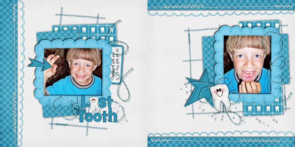
Here’s an example using Chelle’s kit Pearly Whites:

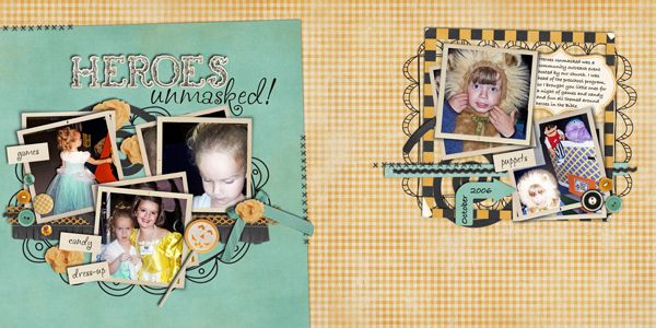
As you can see, I’ve used pretty much the same papers and elements on both sides of the page, but they look a bit different because the one template has been flipped/rotated. Sometimes the flip is obvious as in the above example…and sometimes not so obvious as in the example below where I used Tell Me More:

And then a third option is to switch out the papers of the second page – you can do this whether you’ve used the same template or not. When using the same kit, why not get the most bang for the buck by using a variety of papers! If you like the stacked paper look for a background, simply rearranging the order of the stack can give a very different look to each side…see the two examples below…
For this one I used Bug Catcher

and for this one I used All Hallows Eve

If you are using two different templates you don’t have to flip or rotate one…unless you want too! (And there will be times you’ll want too, but I’ll save that for another time.)
Once I have the general design of my page down, I move on to elements and their placement. Sometimes a ribbon or a scatter crossing from one page to the next is a nice way to tie the pages together. I generally using the same elements on both sides, with maybe one unique element added in on each side. If you look again at the above examples, you can see what I mean.
I’m hoping that was clear and straightforward! If you have any questions, I’d love to hear from you…you can pm me in the ScrapMatters forum, and I’ll be happy to talk with you further!
Merry Christmas, everyone!


No comments:
Post a Comment