....

Don't miss another freebie, sale, or special announcement!
Use the newsletter sign-up forms right over there --->
Pick the one that fits your interests: Regular newsletter or CU only.

Friday, December 31, 2010

New Releases: Printer’s Block Alpha, Templates and New CU Flowers

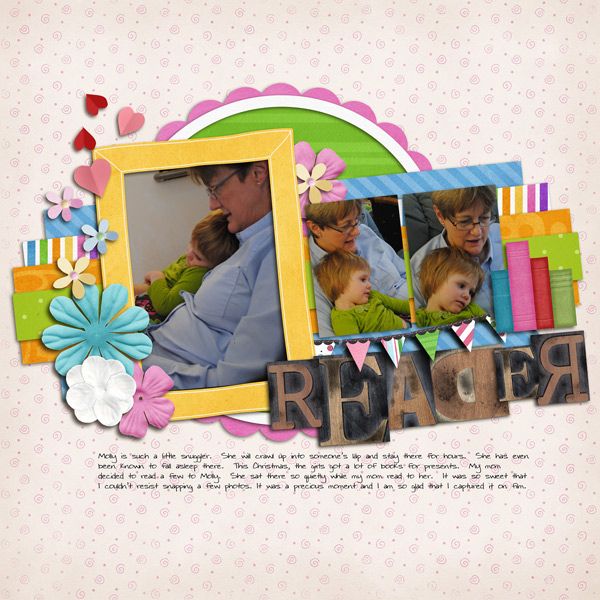
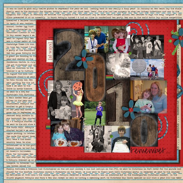
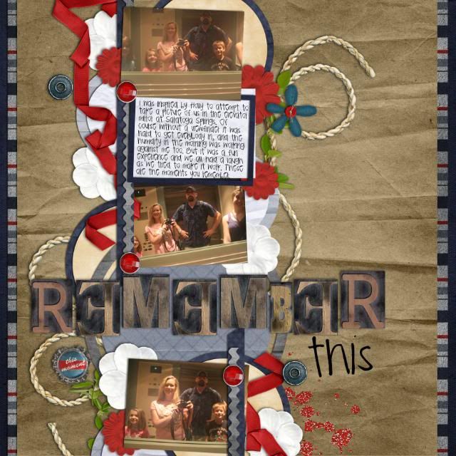
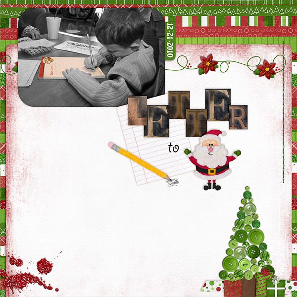
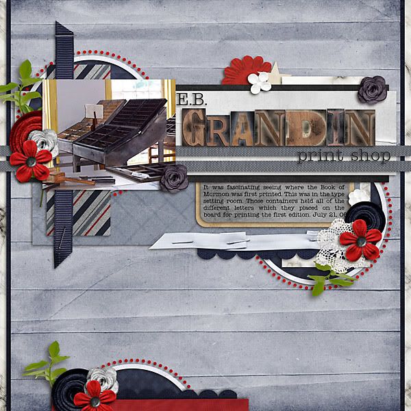
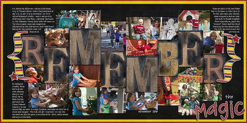
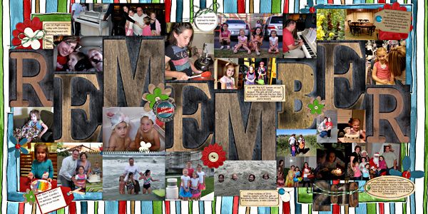
Hello, it is the last new release of 2010 and Chelle is going out with a bang!  First up, Printer’s Block Alpha.  It comes with two shadow angles, so you can flip the letters backwards!  It is really fun and funky cool. 

Chelle also whipped up some templates using the alpha!  Perfect for any year in review or P365 page. Finally for all you CU’ers out there, Chelle has a new set of CU flowers available.

And here is some inspiration from the CT:

Liz:

Fiona:

Jenn:

Janine:

Fran:

Kayla:

Karen:

Tracy:

Shanell:

And that’s it!  Have a fabulous 2010 and see you all in 2011!

Thursday, December 30, 2010

Sneak Peek!

Hi everyone! Kassie (kass_23) here to bring you the sneak peek for this week's fabulous new release. Be sure to check back tomorrow to see the full reveal!!

Tuesday, December 28, 2010

Tuesday Freebie: January 2011 Desktop Freebies

Hello everyone,

It's Kayla (keepscrappin) here on the last Tuesday of 2010. I hope everyone is having a fun and safe last week of 2010.

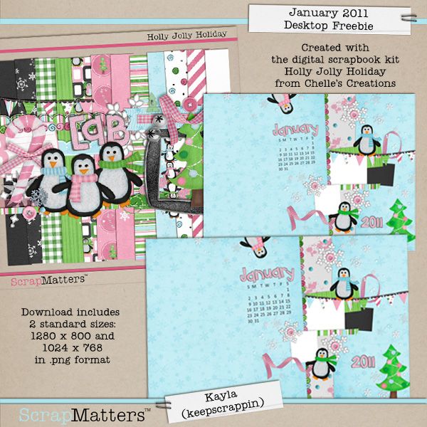
Today, I've got a new desktop to help you start off the new year in style. These desktops are made with Chelle's Creations Holly Jolly Holiday kit and have a spot for a couple of photos. No photos? No problem - leave them blank, and they'll still look cute on your 'puter!

kayla
Download here

Take care and keepscrappin', and I'll see ya'll next month with another desktop freebie.

Monday, December 27, 2010

Want to be RAKed with Chelle's New Journaling Class and get an EXCLUSIVE kit and weekly freebies?

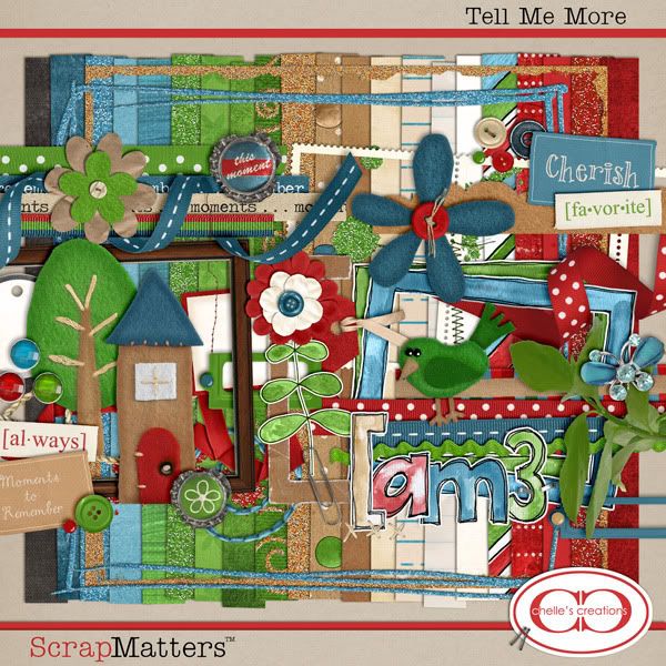
Hi everyone, Janine here with a chance to be RAKed with a spot in Chelle's Creations Tell Me More Journaling Class starting up next month.

The class comes with this amazing and versatile kit that is EXCLUSIVE to class members only, as well as weekly exclusive freebies:


So to have your chance at winning a spot just post below what about journaling you struggle with.

** If you want to double your chances you can also participate in the contest shown HERE.**

This RAK goes until Monday January 3rd at 10 PM CST so make sure to post before then!


The winner chosen by Random.org is Froggie, stay tuned to your PM box for a code to purchase the class, thank you to all who participated!

Spin a CT


Hello everyone and happy Monday! It's Cara (aka colson) here hoping that those of you who celebrated Christmas had a wonderful holiday over the weekend. As I wade through the sea of wrapping paper in my house to get to my computer, I'm excited to share my love for Melissa's (aka prettypeaches) gallery. I chose to spin her "Bridal Shower" layout because I love her use of stacked elements and how she pulled from many kits to make a cohesive layout.
Here's Melissa's layout:


And here's the link to her layout so you can leave her some love.


And here's my interpretation:


I used two kits to create this layout! Hopefully these will inspire you to scrap those special memories... and try using more than one kit to accomplish it! Link us up here so we can see your layouts and leave you some love. Have a great week!

Saturday, December 25, 2010

Merry Christmas!

Hope you are having a festive time with your friends and family!


Love,
Chelle

Wednesday, December 22, 2010

Photoshop Top Tips!!

Hi Everyone! It's Jenn (jk703) here and I have decided to visit you all again this month with some more great time saving tips for Photoshop! I started Digital Scrapping in March 2010 and I've been um... obsessed! I love it! Since I've started to spend time with my software and computer a lot, lol, I decided I needed to learn some useful tips! Through the last few months of using the software, I have learned a few tips that have helped me a lot! I thought I'd share some more of my top tips!

For my layout, I am using Chelle's awesome new kit, Choo Choo! It is such a fun, fantastic and versatile kit and definitely not just for train pictures! This is the preview:


Tip #1: Quick Fit
Sometimes, I like to view my whole layout, but I am working too closely. To quickly fit the image you are working on to the screen you are working in -- just click on that little hand 2 times! Presto! Fit to your view!

This is the Hand that I am referring to:
This is what my layout looks like after I double clicked. Perfect fit to my screen, and I can take a quick look see!

Tip #2: Selections are a Drag!
When I create a layout and make a selection, sometimes it is just not in the right location. If you click and drag your cursor using the Marquee Tool, and notice that you are not in the correct area, don't let that mouse button go! Just press the space bar, and then you can drag your selection to the correct location!

My bad selection... (see I didn't get the whole title included):


If you hold that mouse button down, press the space bar, and drag -- you can move it to the correct location you wanted!


Tip #3: Journaling Preview
I pick and choose so many fonts for my journaling that it takes forever! I used to stare at the font, or try it out and then not like it! Well, how about seeing your journaling in every font, and just deciding by looks which one you like!? No more agonizing!

OK, first step is to have the Type Tool your selected Tool. Then click on your journaling to see the dashed box around it, like this:

Next, you will highlight the text that you have written. It will look something similar to this:


Last, you will click on the Character Menu, and locate the font drop down menu. Click inside the Font name, where it says CK Cooper below. Now, just use your arrow keys and scroll through your fonts slowly. Your journaling will change every time you press the arrow key up or down. So easy to preview! You can also change the size and leading as well!


There you go... some more great tips for scrapping quicker! I hope that you've enjoyed these tips, and come back for more! I'd love to hear some of your great tips, so post them in the comments below! Thanks for visiting!

Happy Holidays!
Jenn
(jk703)


Tuesday, December 21, 2010

Want to win a spot in Chelle's Journaling Class for Free?

Hi everyone, Janine again and Chelle is in a very generous mood so I'm taking advantage of it while I can to give away even more this month. Chelle is letting me give away a spot in her journaling class that is starting up again this January!

The class comes with this amazing and versatile kit that is EXCLUSIVE to class members only, as well as weekly exclusive freebies:


So to win a spot all you have to do is post a linked layout below that showcases mostly Chelle's Creations products and at least four sentences of journaling. This way you can show off your pages to more people too.

If you are posting your layout please try to leave love for the layout before yours so we can all get a little more love for our work.


This contest will run until January 5th at 10 PM CST and the winners will be announced by January 7th. Please remember to credit your layout so that I can see that you used mostly Chelle's products in your layout.


** So remember the details**
1. Post a linked photo of your layout (can be new or old) using mostly Chelle's Creations products.
2. Make sure to list your credits for your layout so everyone can see what you used.
3. Your layout must contain at least four sentences of journaling.
4. Layouts must be posted by January 5th at 10PM CST.
5. Please at least try to leave love for the person who posted above you to share the love this holiday.

I hope everyone has a wonderful Christmas. I can't wait to see your amazing work, now get scrappin' and show me your page!

Thank you to those of you who participated, the winner chosen by Random.org was lynnrienne, congratulations! I hope that the rest of you will still join us in the class since it is starting soon.

Tuesday Freebie!!

Hi everyone! Fiona (canadianmommy) here with this week’s Tuesday Freebie!

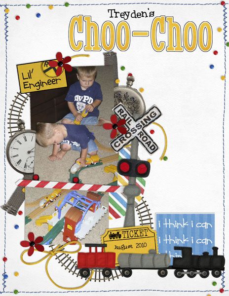
I adore Chelle’s new kit Choo Choo and the Christmas Add-On is just perfect. I had so much fun scrapping this page of my son playing with his very first train set:

wchoochoo

I decided to give it away as a Quick Page!

cc_cm_choochoo_qp_thumb

Add your journaling in the same place as mine or anywhere else you choose. Just click on the image or download here. Enjoy!

Fiona

Saturday, December 18, 2010

Saturday Standouts!

Happy Saturday, everyone! Tracy here with some gallery standouts for you today. Chelle's gallery is filled with so much gorgeousness that it was hard to choose - but here are the three layouts I picked for this week:


On My Way by froggie - I love the layered look of this layout and the fabulous shadow on the curly ribbon:
Birthday Bash by TanyaH666 - again, a fabulously layered layout with terrific shadows (check them out on the 24 candles and the banner):
Lost Tooth by jennschultz - are you seeing a theme here? Great layering on this layout, too!
Hope you've enjoyed this little peek at some of the fantastic layouts in Chelle's gallery and make sure you upload there if you use her products - you could be chosen for a future standouts post!

Friday, December 17, 2010

New Releases: Choo-Choo, Christmas Add-on, and CU Flowers

It is another fabulous Friday and Chelle has great new releases.  First up, do you have a train lover in your life?  If you do, you don’t want to miss out on Choo!Choo!.  Fun colors and gorgeous felt elements, you can scrap all your train layouts.  Also is a special Christmas add-on for pages such as the Polar Express or Christmas Village. You can also snag both of them in a fantastic combo pack.

Chelle also has these gorgeous CU twisted flowers.  These are really stunning and the perfect addition to your CU stash. And here is some gorgeousness from the CT:

Fran:

Jenn:

Liz:

Tracy:

Janine:

Cara:

Jan:

Kayla:

Shanell:

And finally, Chelle whipped up a coordinating freebie:

Have a great weekend!

Thursday, December 16, 2010

Sneak Peek Thursday!!

Hey Everyone!! Melissa here aka. PrettyPeaches, to bring you a sneak peek of what Chelle has to sell this Friday :) I am soooo very excited about this kit, and couldn't wait to play with it :) So I hope you have the same feeling when you see it!!


Chelle also created a super cute add on to this kit :)


Wednesday, December 15, 2010

How To - Using the Stroke Command

kayla

Good morning everyone. It's Kayla (keepscrappin) here with a little How to tip for you today. I'm going to show you how to use the stroke command in Photoshop Elements to make a quick little photo mat for your layout. I'm using PSE 7.0, but these instructions will work in other versions of PSE and PS with slight modifications.

Here's the layout we'll be working on today.
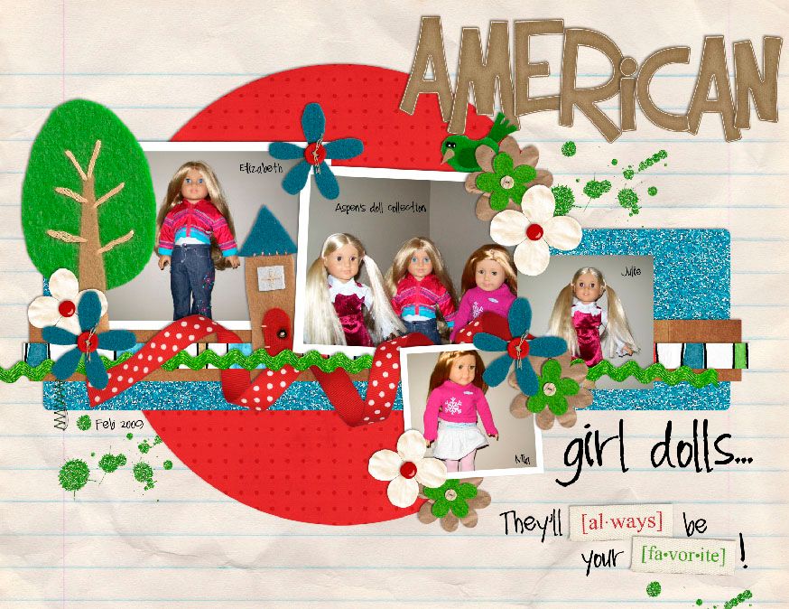
Photobucket

As you can see I have one photo left that still needs a mat. Here's how to add it.

First you'll want to make sure your foreground color is the color you want for your photo mat.
Type D to get the chips to the default of black and white.
Type X to make white your foreground color.

Your color chips should look like this.
Photobucket

Next, you will want to go the layer that needs the mat. Select that layer in the layers palette as shown in the image below.
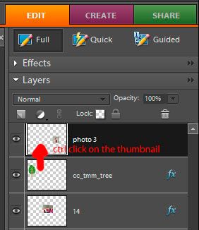
Photobucket

Now that you're on the photo layer, you will want to make a selection of your photo. To make your selection, hold down the control key and click on the thumbnail image of that layer in the layers palette as the arrow in the above image shows. That will put marching ants around your photo.
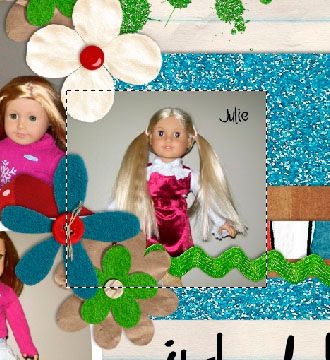
Photobucket

Let's talk a little bit about the stroke command. It will use the foreground color to put an outline around your selection. This is how we will make our photo mat. To access the stroke command, you will click on Edit, Stroke (outline selection) as shown in the image below.
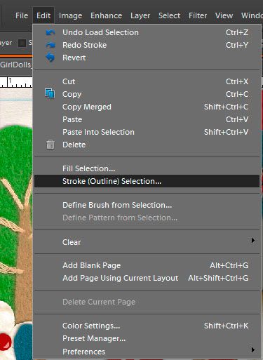
Photobucket

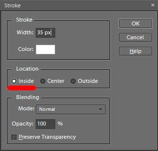
A pop-up dialog will come up and you will want to input the following:
Photobucket

The width determines how big your mat will be. I usually go with 25 or 35 px - depending on how big my photo is.

The Location is another important part of the stroke command. It determines where or how your selection will be outlined. I like to use the INSIDE LOCATION, because it makes my corners crisp and pointed. You can see that the outline stays inside the marching ants when I use the inside location, and the corners stay nice and pointed.
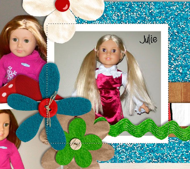
Photobucket

If I use the the Center location, the outline is placed half inside the marching ants and half outside of the marching ants. Notice too, how it makes the outside corners of the photo a little rounded.
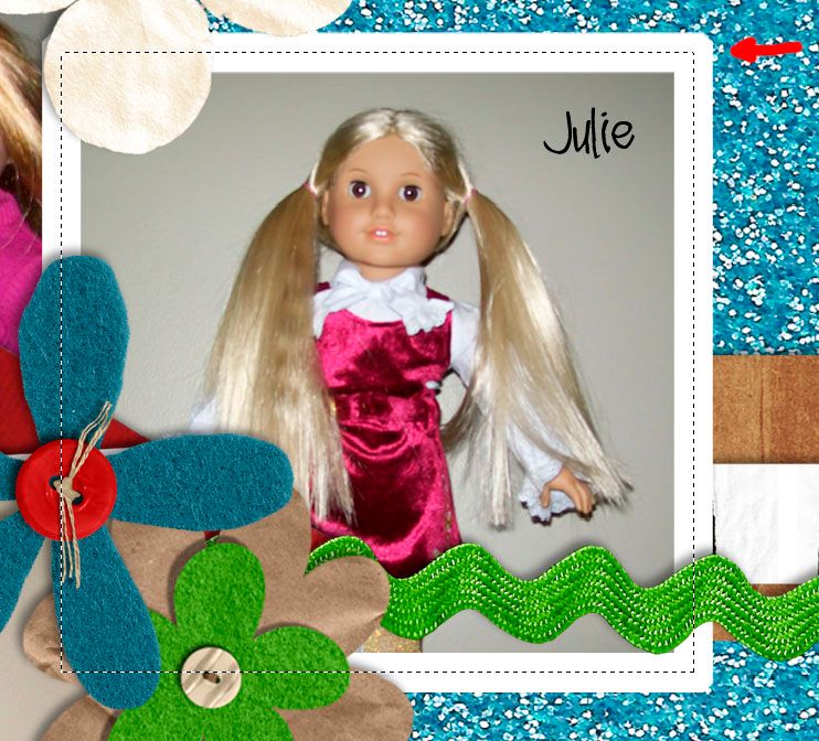
Photobucket

If I use the Outside location, the outline is placed completely outside of the marching ants. It also cuts the corners.
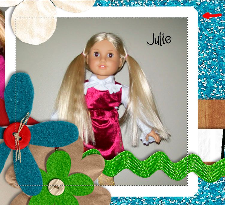
Photobucket

Now that you know what each location does to the corners of your outline, it's up to you to chose which look you like best for your layout.

Once you've added your stroke outline to your photo layer, you can hit control plus d to deselect the photo and turn off the marching ants. Now, it's time to add your shadows and finish up the layout.

The stroke command is very useful and can be used for more than just photo mats. One idea is that you can add an outline to any shape, or alpha to make it look like a sticker. The possibilities are endless, so have fun playing with the stroke command, and come back next week for another How to that will help take your scrappin to the next level.

Here's my finished layout.


It uses Chelle's Tell Me More kit which is only available in her upcoming Tell Me More Journaling Class in January 2011.


Well, that's it for today. Take care and as always keepscrappin!

p.s. Watch your Chelle's Creations newsletters for a special discount code for the journaling class. **wink** You can sign up for free in the box on the right side of this blog.